[X]STRYV
A product redesign that turned broken navigation and undefined flows into a platform presented at Slush 2025.
A product redesign that turned broken navigation and undefined flows into a platform presented at Slush 2025.
UX & Product Designer
Role
Product Design
UX Architecture
User Flows
Marketing Design
Services
May 2025 — Oct 2025
Date
[X] STRYV is a talent-matching SaaS platform that connects startups with students and recent graduates looking for career opportunities. I led the UX/UI for the platform’s core engagement loops, candidate tracking system, and the new token-based monetization architecture for the September 2025 launch event in Helsinki.
[X] STRYV is a talent-matching SaaS platform that connects startups with students and recent graduates looking for career opportunities. I led the UX/UI for the platform’s core engagement loops, candidate tracking system, and the new token-based monetization architecture for the September 2025 launch event in Helsinki.

Challenge
Challenge
The platform was live but essentially dead. While the startup had accumulated 1000+ registered users, there was zero retention. Candidates were getting lost in broken flows, startups couldn't navigate the system, and matching was being done manually by the company's employees on the backend.
The platform was live but essentially dead. While the startup had accumulated 1000+ registered users, there was zero retention. Candidates were getting lost in broken flows, startups couldn't navigate the system, and matching was being done manually by the company's employees on the backend.
The platform was live but essentially dead. While the startup had accumulated 1000+ registered users, there was zero retention. Candidates were getting lost in broken flows, startups couldn't navigate the system, and matching was being done manually by the company's employees on the backend.
Goal
Goal
Rebuild the core platform ecosystem in just 4 months. My specific objective was to design a self-serve engine where candidates actually want to return, and startups can seamlessly manage pipeline and pay for matches, all in time for the major Startup Crawl launch event on September 18 in Helsinki.
Rebuild the core platform ecosystem in just 4 months. My specific objective was to design a self-serve engine where candidates actually want to return, and startups can seamlessly manage pipeline and pay for matches, all in time for the major Startup Crawl launch event on September 18 in Helsinki.
Rebuild the core platform ecosystem in just 4 months. My specific objective was to design a self-serve engine where candidates actually want to return, and startups can seamlessly manage pipeline and pay for matches, all in time for the major Startup Crawl launch event on September 18 in Helsinki.
Context
Context
I joined the project in May 2025. The brief was brutal: new design, integrate AI matching, and hit the launch deadline with a tiny team and no user research budget.
We made a strategic decision on day one: prioritize structural UX, logic, and rapid prototyping over pixel-perfect UI. To hit the deadline, we relied on an AI-assisted UI library for the visual implementation. This allowed us to spend our limited time solving actual business problems rather than tweaking border radiuses.
I joined the project in May 2025. The brief was brutal: new design, integrate AI matching, and hit the launch deadline with a tiny team and no user research budget.
We made a strategic decision on day one: prioritize structural UX, logic, and rapid prototyping over pixel-perfect UI. To hit the deadline, we relied on an AI-assisted UI library for the visual implementation. This allowed us to spend our limited time solving actual business problems rather than tweaking border radiuses.
I joined the project in May 2025. The brief was brutal: new design, integrate AI matching, and hit the launch deadline with a tiny team and no user research budget.
We made a strategic decision on day one: prioritize structural UX, logic, and rapid prototyping over pixel-perfect UI. To hit the deadline, we relied on an AI-assisted UI library for the visual implementation. This allowed us to spend our limited time solving actual business problems rather than tweaking border radiuses.
The Baseline: Why 1000+ Users Weren't Converting
The Baseline: Why 1000+ Users Weren't Converting

The Legacy Dashboard. Candidate data was presented as a wall of unstructured text. Before introducing token pricing, we had to solve this cognitive overload to ensure recruiters could actually extract value from the platform.
The Legacy Dashboard. Candidate data was presented as a wall of unstructured text. Before introducing token pricing, we had to solve this cognitive overload to ensure recruiters could actually extract value from the platform.
The Legacy Dashboard. Candidate data was presented as a wall of unstructured text. Before introducing token pricing, we had to solve this cognitive overload to ensure recruiters could actually extract value from the platform.

Dead-end flows and empty states. The legacy platform suffered from "black holes" where user journeys suddenly stopped. Pipeline management tools offered zero context. Fixing this was key activating the user base.
Dead-end flows and empty states. The legacy platform suffered from "black holes" where user journeys suddenly stopped. Pipeline management tools offered zero context. Fixing this was key activating the user base.
Dead-end flows and empty states. The legacy platform suffered from "black holes" where user journeys suddenly stopped. Pipeline management tools offered zero context. Fixing this was key activating the user base.
Ideation & Cross-Functional Alignment
Ideation & Cross-Functional Alignment
Because we were working with complex AI-matching algorithms and a brutal 4-month deadline, skipping straight to high-fidelity UI would have been a disaster. We needed a shared language.
Before opening Figma, we kicked off the project with intensive team brainstorming sessions. Working hand-in-hand with the developers, we mapped out the core user flows and technical limitations on a whiteboard. This early alignment was crucial. It wasn't just about drawing boxes; it was about building a solid bridge between design intent and technical feasibility.
By establishing this connection from day one, we ensured the whole team thought in the same direction: preventing lost context, minimizing miscommunication, and allowing us to move incredibly fast during sprints.
Because we were working with complex AI-matching algorithms and a brutal 4-month deadline, skipping straight to high-fidelity UI would have been a disaster. We needed a shared language.
Before opening Figma, we kicked off the project with intensive team brainstorming sessions. Working hand-in-hand with the developers, we mapped out the core user flows and technical limitations on a whiteboard. This early alignment was crucial. It wasn't just about drawing boxes; it was about building a solid bridge between design intent and technical feasibility.
By establishing this connection from day one, we ensured the whole team thought in the same direction: preventing lost context, minimizing miscommunication, and allowing us to move incredibly fast during sprints.

Problem: The Application
"Black Hole"
Problem: The Application
"Black Hole"
My scope: Talent Dashboard, "All Jobs" Discovery flow, and the "My Applications" Hub.
My scope: Talent Dashboard, "All Jobs" Discovery flow, and the "My Applications" Hub.
In the old version of the platform, the talent experience ended the moment they hit "Apply." They had no visibility into their status, leading to high drop-off rates and frustration. It was a classic "black hole" experience.
I redesigned the entire post-application journey. I created the Talent Dashboard and the My Applications hub not just as lists of links, but as transparent "waiting rooms." By surfacing match scores, saved alerts, and clear, step-by-step application statuses, I gave control back to the candidates. The design goal was simple: reduce anxiety to increase platform retention.
In the old version of the platform, the talent experience ended the moment they hit "Apply." They had no visibility into their status, leading to high drop-off rates and frustration. It was a classic "black hole" experience.
I redesigned the entire post-application journey. I created the Talent Dashboard and the My Applications hub not just as lists of links, but as transparent "waiting rooms." By surfacing match scores, saved alerts, and clear, step-by-step application statuses, I gave control back to the candidates. The design goal was simple: reduce anxiety to increase platform retention.
Early UX ideation. My paper sketches mapping out the relationship between the 'All Jobs' interface and the underlying databases, ensuring the logic was solid before touching any digital tools.
Early UX ideation. My paper sketches mapping out the relationship between the 'All Jobs' interface and the underlying databases, ensuring the logic was solid before touching any digital tools.
Early UX ideation. My paper sketches mapping out the relationship between the 'All Jobs' interface and the underlying databases, ensuring the logic was solid before touching any digital tools.
Me, explaining
the concept
Me, explaining
the concept

The Talent Dashboard. Instead of a dead end, I designed a central hub that gives candidates immediate visibility into their activity metrics, personalized job matches, and profile completion, keeping them engaged within the ecosystem.
The Talent Dashboard. Instead of a dead end, I designed a central hub that gives candidates immediate visibility into their activity metrics, personalized job matches, and profile completion, keeping them engaged within the ecosystem.
The Talent Dashboard. Instead of a dead end, I designed a central hub that gives candidates immediate visibility into their activity metrics, personalized job matches, and profile completion, keeping them engaged within the ecosystem.


My Applications & All Jobs. By surfacing match scores and saving alerts, I gave control back to the candidates. The design goal was simple: reduce anxiety to increase platform retention.
My Applications & All Jobs. By surfacing match scores and saving alerts, I gave control back to the candidates. The design goal was simple: reduce anxiety to increase platform retention.
Problem: Friction in Supply
(Job Creation)
Problem: Friction in Supply
(Job Creation)
My scope: Company User Flow and the Job Import Wizard.
My scope: Company User Flow and the Job Import Wizard.
A two-sided marketplace dies if there is no supply (jobs). The legacy platform featured a static, uninspiring empty state that forced busy HR managers to manually type out job descriptions from scratch — acting as a massive barrier to entry.
To solve this, I designed the Job Import Wizard. I introduced a drag-and-drop PDF autofill feature and broke the creation process into a clear, step-by-step progress bar (Role Discovery → Preview → Recruitment → Payment). By reducing the cognitive load and integrating payment directly into the creation flow, I drastically reduced the "Time-to-Publish," effectively removing the bottleneck for populating the platform with new roles.
A two-sided marketplace dies if there is no supply (jobs). The legacy platform featured a static, uninspiring empty state that forced busy HR managers to manually type out job descriptions from scratch, acting as a massive barrier to entry.
To solve this, I designed the Job Import Wizard. I introduced a drag-and-drop PDF autofill feature and broke the creation process into a clear, step-by-step progress bar (Role Discovery → Preview → Recruitment → Payment). By reducing the cognitive load and integrating payment directly into the creation flow, I drastically reduced the "Time-to-Publish," effectively removing the bottleneck for populating the platform with new roles.
A two-sided marketplace dies if there is no supply (jobs). The legacy platform featured a static, uninspiring empty state that forced busy HR managers to manually type out job descriptions from scratch — acting as a massive barrier to entry.
To solve this, I designed the Job Import Wizard. I introduced a drag-and-drop PDF autofill feature and broke the creation process into a clear, step-by-step progress bar (Role Discovery → Preview → Recruitment → Payment). By reducing the cognitive load and integrating payment directly into the creation flow, I drastically reduced the "Time-to-Publish," effectively removing the bottleneck for populating the platform with new roles.
The Job Import Wizard. To remove the bottleneck of manual data entry, I designed an automated pipeline with PDF autofill and a clear progress timeline, significantly reducing the Time-to-Publish for HR managers.
The Job Import Wizard. To remove the bottleneck of manual data entry, I designed an automated pipeline with PDF autofill and a clear progress timeline, significantly reducing the Time-to-Publish for HR managers.
Bridging Online and Offline: The Startup Crawl
Bridging Online and Offline: The Startup Crawl
My scope: Website creation
My scope: Website creation
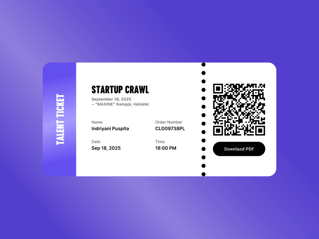
The deadline for the entire redesign wasn't random: it was set by the Startup Crawl on September 18, 2025, in Helsinki. The platform needed to function not just as a hiring tool, but as the digital backbone for this physical event.
I designed the ticketing flow to integrate seamlessly into both the talent and company dashboards. By registering for a ticket through their dashboard, candidates inadvertently completed their profile setup, turning event registration into a massive user acquisition loop.
The deadline for the entire redesign wasn't random: it was set by the Startup Crawl on September 18, 2025, in Helsinki. The platform needed to function not just as a hiring tool, but as the digital backbone for this physical event.
I designed the ticketing flow to integrate seamlessly into both the talent and company dashboards. By registering for a ticket through their dashboard, candidates inadvertently completed their profile setup, turning event registration into a massive user acquisition loop.
The deadline for the entire redesign wasn't random: it was set by the Startup Crawl on September 18, 2025, in Helsinki. The platform needed to function not just as a hiring tool, but as the digital backbone for this physical event.
I designed the ticketing flow to integrate seamlessly into both the talent and company dashboards. By registering for a ticket through their dashboard, candidates inadvertently completed their profile setup, turning event registration into a massive user acquisition loop.
Brand Identity & Event Identity
Brand Identity & Event Identity
My scope: Event Visual Identity, Social Media Assets, Print (Posters & Apparel), Logo Refresh.
My scope: Event Visual Identity, Social Media Assets, Print (Posters & Apparel), Logo Refresh.
While my primary focus was UX architecture, the reality of working in an early-stage startup is that you wear multiple hats. Alongside the product work, I took ownership of the visual identity for the September 18 Startup Crawl event.
I designed a comprehensive asset library that bridged the digital platform with the physical streets of Helsinki. This included printed outdoor posters, an engaging social media series for Instagram, and motion graphics for venue screens. I also refreshed the brand logo to ensure it worked flawlessly across both digital interfaces and physical print, which the team proudly wore on their hoodies during the event.
To ensure the marketing team could move as fast as the product team, I built a library of modular Adobe templates. This allowed them to continuously produce on-brand assets without me becoming a bottleneck.
While my primary focus was UX architecture, the reality of working in an early-stage startup is that you wear multiple hats. Alongside the product work, I took ownership of the visual identity for the September 18 Startup Crawl event.
I designed a comprehensive asset library that bridged the digital platform with the physical streets of Helsinki. This included printed outdoor posters, an engaging social media series for Instagram, and motion graphics for venue screens. I also refreshed the brand logo to ensure it worked flawlessly across both digital interfaces and physical print, which the team proudly wore on their hoodies during the event.
To ensure the marketing team could move as fast as the product team, I built a library of modular Adobe templates. This allowed them to continuously produce on-brand assets without me becoming a bottleneck.
While my primary focus was UX architecture, the reality of working in an early-stage startup is that you wear multiple hats. Alongside the product work, I took ownership of the visual identity for the September 18 Startup Crawl event.
I designed a comprehensive asset library that bridged the digital platform with the physical streets of Helsinki. This included printed outdoor posters, an engaging social media series for Instagram, and motion graphics for venue screens. I also refreshed the brand logo to ensure it worked flawlessly across both digital interfaces and physical print, which the team proudly wore on their hoodies during the event.
To ensure the marketing team could move as fast as the product team, I built a library of modular Adobe templates. This allowed them to continuously produce on-brand assets without me becoming a bottleneck.

Outcomes & Impact
Outcomes & Impact
We hit the September 18 deadline. The platform wasn't just a prototype; it was live and handling real traffic during the Startup Crawl.
We hit the September 18 deadline. The platform wasn't just a prototype; it was live and handling real traffic during the Startup Crawl.
500+ talent registrations
The new onboarding and "My Applications" flow successfully converted traffic into registered, active users.
The new onboarding and "My Applications" flow successfully converted traffic into registered, active users.
30+ startups actively posting
30+ startups actively posting
The Job Import Wizard drastically reduced the friction of creating listings, populating the platform with real opportunities.
The Job Import Wizard drastically reduced the friction of creating listings, populating the platform with real opportunities.
A two-sided market activated
A two-sided market activated
The previous legacy platform had accumulated 1000+ users over multiple years but had zero activity. The redesigned platform reached half that registration count in just 30 days, but this time, both sides were actually interacting.
The previous legacy platform had accumulated 1000+ users over multiple years but had zero activity. The redesigned platform reached half that registration count in just 30 days, but this time, both sides were actually interacting.


What I've learned
Trade-offs are the real design work
The single most important decision on this project wasn't a specific screen. It was the early call to prioritize UX architecture and logic over UI ownership so we could hit the deadline. Knowing what to let go of mattered more than knowing what to design.
The single most important decision on this project wasn't a specific screen. It was the early call to prioritize UX architecture and logic over UI ownership so we could hit the deadline. Knowing what to let go of mattered more than knowing what to design.
Business logic comes before UI
The hardest part of designing the billing system wasn't making it look good; it was understanding how token economies work. I learned that as a product designer, if you don't understand the underlying business model, you can't design a functional interface for it. My BBA background was critical here.
The hardest part of designing the billing system wasn't making it look good; it was understanding how token economies work. I learned that as a product designer, if you don't understand the underlying business model, you can't design a functional interface for it. My BBA background was critical here.
Prioritization is the ultimate design skill
With only 4 months and a tiny team, we couldn't build everything. Letting the developers use an AI-assisted UI library for the visual layer so I could focus purely on UX architecture (flows, dashboards, checkout) was the best decision we made. It taught me where a designer's time actually creates the most value.
With only 4 months and a tiny team, we couldn't build everything. Letting the developers use an AI-assisted UI library for the visual layer so I could focus purely on UX architecture (flows, dashboards, checkout) was the best decision we made. It taught me where a designer's time actually creates the most value.
Post-launch validation is everything
With more time and budget, I would have validated these flows with real recruiters and candidates before shipping. The 500+ registrations told us the platform was attractive enough to sign up for, but post-launch usability research would be the immediate next step if we had kept building.
With more time and budget, I would have validated these flows with real recruiters and candidates before shipping. The 500+ registrations told us the platform was attractive enough to sign up for, but post-launch usability research would be the immediate next step if we had kept building.
Scroll up
Me, explaining
the concept